Daily Tech Briefing
AI 科技速览
每天 5 分钟内学习 AI。获取最新的人工智能新闻,理解其重要性,并学习如何将其应用于您的工作。
AWS ML Blog · 2026/7/23 16:40:59
Building multi-Region visualizations with Highcharts in Amazon Quick
AI 中文解读
【核心亮点】用Highcharts给亚马逊QuickSight装上“定制图表引擎”,轻松搞定跨地区、多运营商的复杂数据对比,不必再为不同国家做多个仪表盘。
【通俗解读】假如你要同时看美国和英国多个运营商的表现,美国有3家运营商、49个州,英国有4家运营商、不同区域,原生图表根本没法画到一张图上。过去你得分别建两个仪表盘,或者用笨办法把数据硬凑在一起,结果细节全丢了。现在通过嵌入Highcharts这个第三方图表工具,你能用一个统一的配置实现“一图看全局”:比如用色块地图直接标出每个地区谁领先,用雷达图同时对比7家运营商在7项指标上的优劣,用子弹图看是否达标,用哑铃图看同一运营商最好和最差市场的差距——所有数据都保留原始细节,不用再折中处理。
【实际影响】对普通用户来说,这意味着你看业务报告时能更直观地抓住关键信息:哪个市场该重点进攻、哪家运营商在滑坡、不同地区的竞争格局有何差异,而不是被一堆散乱的表格和折中后的平均数搞糊涂。企业决策者能更快做出判断,比如资源该往哪儿投、是否需要调整区域策略,最终降低沟通成本、提升决策效率。
<p>When your carrier performance data spans multiple regions, your dashboard must reconcile fundamentally different competitive structures within a single view. For example, in the US, you rank three carriers (Carrier 1–3) across 49 states and hundreds of metro markets. In the UK, you’re comparing four carriers (Carrier 4–7) across a separate set of national regions. The challenge you face is not only geographic but also structural.</p>
<p>The differences in carrier count, market density, and regional detail between these two geographies mean that no single out-of-the-box chart type can tell your full story. You need visualizations that answer layered questions simultaneously: who leads, by how much, how consistently, and whether they are improving or declining.</p>
<p>You will find that native <a href="https://aws.amazon.com/quick/quicksight/" target="_blank" rel="noopener">Amazon Quick</a> visualizations do not tell your full story when you try to answer these questions at scale. Amazon Quick Sight can’t encode which carrier or combination of carriers dominates each geographic tile. It can’t render a radar chart that profiles all seven carriers across seven performance categories simultaneously. And it can’t produce chart types such as bullet charts and dumbbell charts, which you need to surface the nuances in your data.</p>
<p>Every time you try to approximate these visuals in native Quick Sight, you end up building separate dashboards per Region, using stacked bar workarounds for deltas, or averaging metrics that mask volatility between a carrier’s best and worst markets. These compromises add maintenance overhead and obscure the insights your stakeholders need to make confident, data-driven decisions.</p>
<p>By embedding Highcharts as a custom visual in Quick Sight, you address these limitations with a single, unified JSON configuration. With its tilemap chart type and <code>colorAxis.dataClasses</code>, you can encode carrier dominance (including multi-carrier ties) across multiple regions in one visual, with legend toggles for region filtering. Its polar line chart renders a true polygon radar for multi-carrier, multi-category comparison, giving you the full competitive profile.</p>
<p>Beyond geographic and radar views, Highcharts unlocks the chart types your analysis demands. You can use bullet charts to show performance against a 100-point target with color-banded zones, dumbbell charts to expose the spread between a carrier’s best and worst metro market, and waterfall charts to break down period-over-period score deltas.</p>
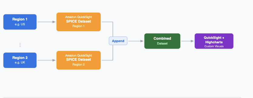
<p>This post shows you how to build multi-Region carrier performance dashboards in Quick Sight using Highcharts custom visualizations to overcome native chart limitations. You will learn how to maintain data sovereignty across AWS Regions while creating unified visualizations through the Quick Sight federated dataset capability. The solution includes production-ready chart configurations and addresses security, compliance, and scalability requirements.</p>
<h2 id="solution-overview">Solution overview</h2>
<p>Your architecture depends on factors such as data residency requirements, latency needs, and compliance obligations. Two architectural patterns address this:</p>
<h3 id="option-1-single-aws-region">Option 1: Single AWS Region</h3>
<p>With this approach, you store carrier data (for example, both US and UK) in one AWS Region (for example, <code>us-east-1</code> or <code>eu-west-1</code>), using a single <a href="https://docs.aws.amazon.com/quick/latest/userguide/spice.html" target="_blank" rel="noopener">Quick Sight SPICE</a> (Super-fast, Parallel, In-memory Calculation Engine) dataset with a country column to logically identify the data.</p>
<p>While this architecture is simpler for you to manage with one dataset and one SPICE refresh, it carries a potential drawback: if you choose a US-based Region, your data physically resides outside the UK, which may conflict with the UK General
分享
阅读原文 ↗